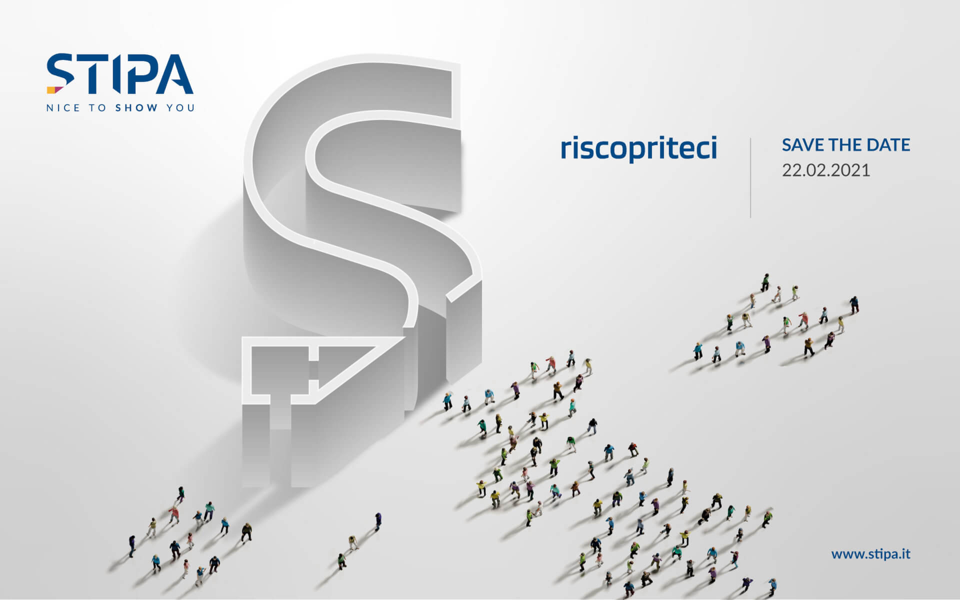
STIPA new logo was born from the idea of renovating and giving more importance to our brand present in the market since 1967.
We have kept some features of the old logo: colors, yellow and magenta, which appear in the lower cut of the first letter "S".
A way to keep ties with the past, meanwhile offering a new presentation style.
The creation of the new logo uses two specular diagonal cuts that follow an angle of 36 ° with respect to the horizontal plane. (1)
The negative space obtained from the central letters creates a perspective, simulating a 3D setting. (2)
The initial lettering S follows the golden proportions (neuroscience identifies the most beautiful rectangle first) and various details are also obtained thanks to the consequent golden spiral. (3)